
Case study · 01 — Logo & packaging
DIP
Sweet heat, perfected.
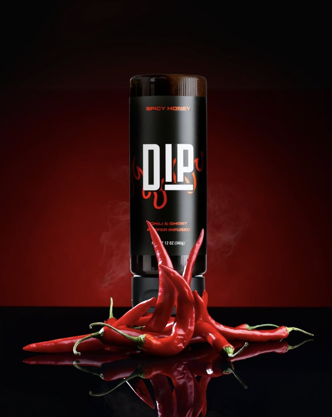
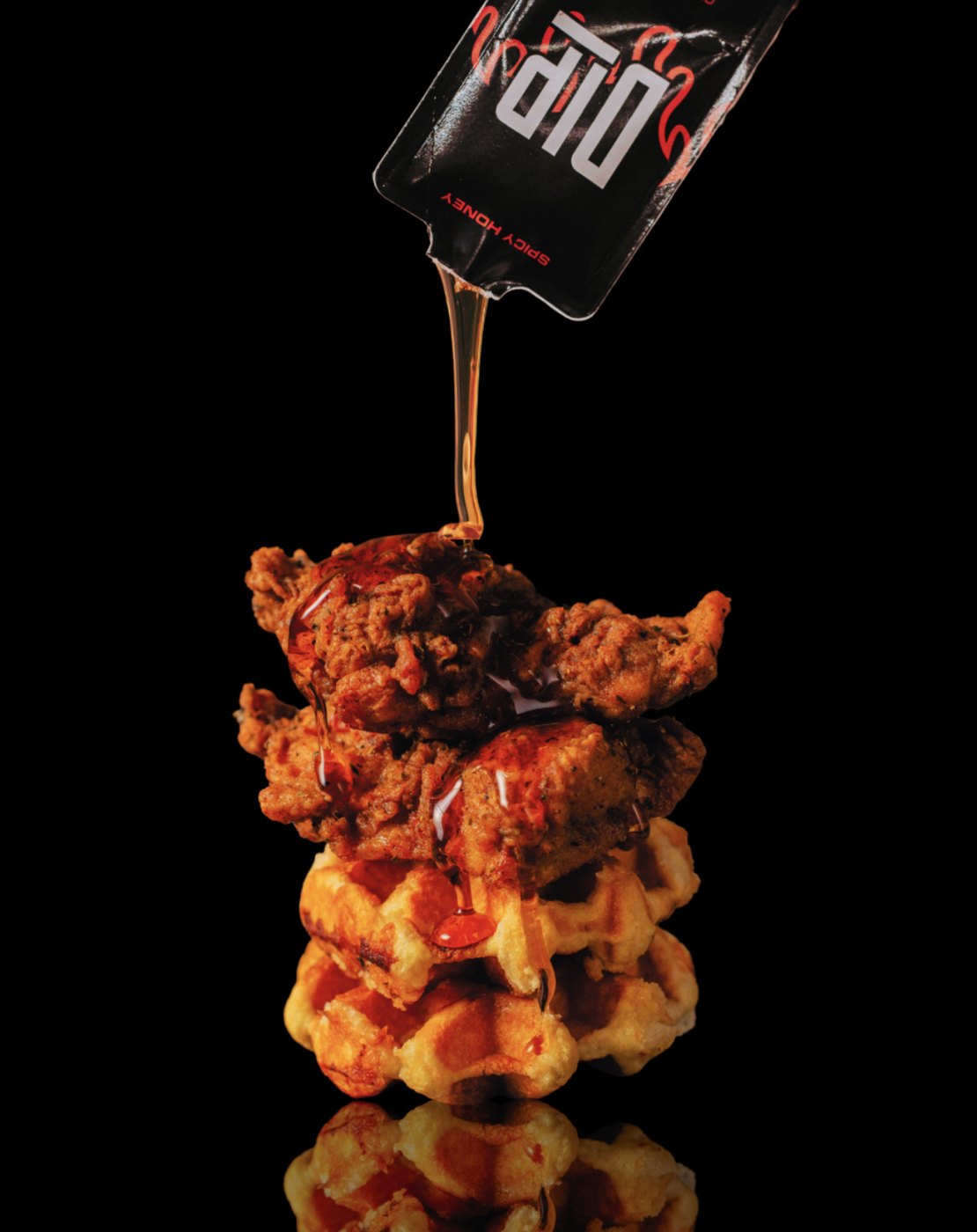
DIP is a spicy honey brand born at a family barbecue in Metro Detroit: pure honey infused with chili and ghost peppers, now a favorite of chefs, restaurants and arenas. We designed the DIP logo and the packaging system that carries it across every product, from the squeeze bottle to the single-serve packet and the seasoning shaker.
- Services
- Logo design
Packaging design - Products
- Spicy Honey
Honey packets
Spicy Honey Seasoning - Based in
- Metro Detroit
- Year
- 2023


01 — The mark
Three letters, all heat.
A tall, condensed wordmark in white, with the I and P dropped onto an underline, like a drip settling at the bottom of the jar. On pack, hand-drawn flames rise up behind it in chili red.
02 — Packaging
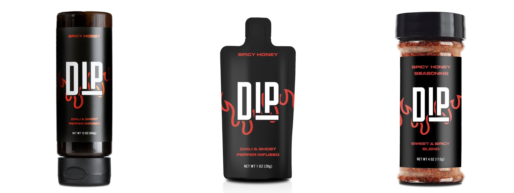
One system, three forms.
Matte black, chili-red type and the flame-wrapped mark make DIP instantly recognizable on the shelf, from the 12 oz squeeze bottle to the 1 oz to-go packet and the 4 oz seasoning shaker.
From a backyard barbecue to chefs, restaurants and arenas.
Next project
Detroit Achievement Academy →